
ALLBEING

objective
The brand wanted to launch a cutting-edge nutraceutical product that offers traceable, dependable, and sustainable supplements that balance your health on a day-to-day basis.
UX challenge
To launch itself as a brand with scientific credibility and ingredient traceability, a large amount of data needed to be presented without overwhelming the users. The data needs to provide all the ingredient facts and origin, details of the extraction process and other back label information.
design challenge
The brand wanted to place itself in a lifestyle space rather than in a clinical and sterile zone. So visually, the persuasion of the website needed to be evocative and emotional.
Responsibilities
Brand strategy | User Experience Design | Art Direction | Graphic Design | Packaging Design
process highlights
Research | Competition and Context Study: Medical journals and research papers were referred to understand the needs of the users and their mental model of the product and its disposition. Thorough research was done on international brands operating in the nutraceutical domain and their offerings and brand USPs.
Persona Outline: Product information was segregated at 2 levels:
A “light” user who would read the top-level information to make a purchase decision.
A heavy user who would read into all the details of the product to make a buying decision.
Key Narratives of Ideation: To empower the user with detailed information about each ingredient of every product, the architecture was designed to make the data available for the user without cluttering or overwhelming the user experience through Progressive Disclosure.
An abridged version of the product information was displayed with minimal interaction for the light user and a deep dive was provided in an intuitive framework for the heavy user.
The design of the service needed to have a whimsical angle to not place itself in a serious and sterile visual space and also push the proposition of bleeding-edge science. The proposition of ‘’Quirk meets Cutting Edge” was followed as the design language. The content was crafted following the same ethos too.
Guerrilla Usability Testing
The product was tested in the circle of acquaintances to check the ease of use and effectiveness of the design.
Outcome
The reception of the brand has been very positive since its launch in December 2020. I’ve received multiple communication from the client narrating and complementing the design and the user’s positive reaction to it.
UI design


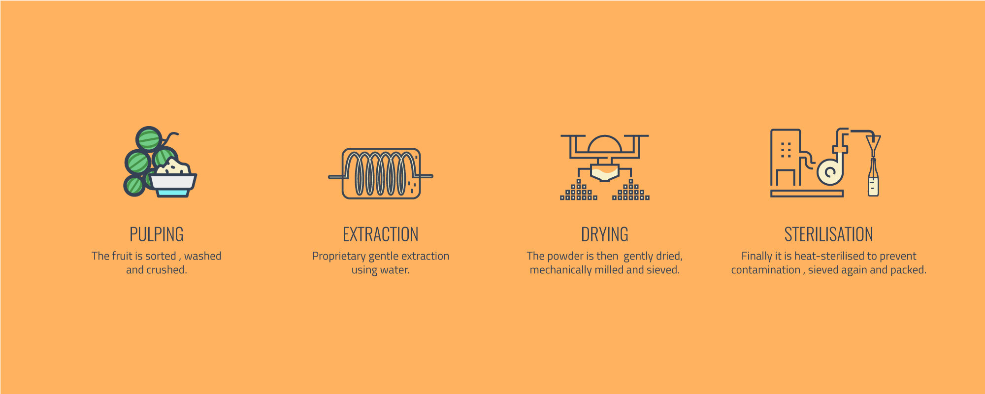
ICONOGRAPHY
The design language was extended to create visual and graphical assets for the brand.
ART DIRECTION & design


packaging
My responsibility was proactively extended to packaging design too to further extend the design language established for the brand.
After user inputs, the final design was chosen by the client for production.


